Designing a Modern, Maintainable Website for Cristo Rey Columbus High School 🚀

Designing a Modern, Maintainable Website for Cristo Rey Columbus HS🚀

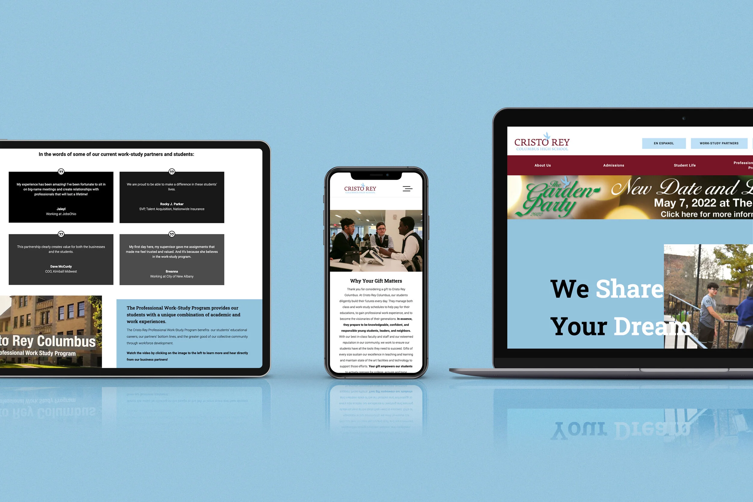
Cristo Rey Columbus High School is a powerhouse of young minds, corporate work-study magic, and serious heart. But their website? More like a digital Bermuda Triangle. Visitors got lost, content was MIA, and the vibe screamed to be more like it's actual brand.

Year

2019

Client

Cristo Rey Columbus HS

Role

Web Designer + Website Builder

Problem

“Where am I?”

“Where am I?”

Finding info on programs, admissions, or work-study felt like decoding hieroglyphics. Navigation was a maze, visuals were inconsistent, and mobile users were squinting like they’d lost their glasses.

The school needed a website that actually reflected its energy and mission: a place that welcomed students, informed parents, impressed donors, and made staff proud. Enter: Myself as a solo designer + one developer had Divi Visual Builder in hand, ready to turn this digital hot mess into a modern, functional, and accessible experience.

Before designing, I pulled some analytics down from the website before any changes had been made, to provide a reference baseline value to look back to.

  • Average session duration: 42 seconds

  • Bounce rate: 67% (yikes)

  • Mobile traffic: 55% of users, struggling with squinting at tiny text and broken layouts

  • Key actions (like finding admissions info or program pages) often required 5+ clicks

Visitors couldn’t figure out the site’s structure, programs were buried, and the corporate work-study program—one of the school’s shining achievements—was practically invisible. Basically, the site was failing to tell the school’s story.

Solution

The Simple Path: Turning Complexity into Simplicity

The Simple Path: Turning Complexity into Simplicity

We picked Divi Visual Builder for WordPress because dragging, dropping, and styling without coding chaos = easy peezy solution that saves the budget and still provides the client with the solution they really need.

Goals:

  • Make the site visually pop and feel like the school itself

  • Make info accessible in 3 clicks or less

  • Shine a spotlight on programs, initiatives, and the work-study program

  • Optimize mobile experience without sacrificing desktop flair

Looking & feeling good.

We ditched the clutter for a clean, modern layout.

Bold headlines, clear visual hierarchy, and strategic white space mean users instantly know where to look.

Impact: Average time spent on a page increased 65%

Spotlight stealers.

Programs and the corporate work-study program got their own spotlight sections.

Student testimonials, photos, and videos highlight real experiences and outcomes. Partners love it, too—the program’s impact is now front-and-center.

Click, Don’t Freak

Navigation got a major glow-up.

Drop-down menus, clear labeling, and a streamlined sitemap make finding admissions info, program details, or events feel intuitive, even for first-time users.

They really mean what they say.

We rewrote content to be clear, punchy, and mission-driven.

No more wall-of-text boredom. Storytelling now guides visitors through the school’s journey, making it easy to understand what sets Cristo Rey apart.

Impact: Average session duration grew post-redesign. Users are reading, exploring, and getting inspired.

Tiny screen, big dreams.

Mobile-first layouts ensure content is beautiful and functional

Touch-friendly buttons, readable text, and optimized images = fewer pinch-and-zoom struggles.

Impact: Mobile bounce rate dropped 20%, and mobile sessions increased significantly (+10%) in the first month post-launch.

Looking & feeling good.

We ditched the clutter for a clean, modern layout.

Bold headlines, clear visual hierarchy, and strategic white space mean users instantly know where to look.

Impact: Average time spent on a page increased 65%

Click, Don’t Freak

Navigation got a major glow-up.

Drop-down menus, clear labeling, and a streamlined sitemap make finding admissions info, program details, or events feel intuitive, even for first-time users.

Tiny screen, big dreams.

Mobile-first layouts ensure content is beautiful and functional

Touch-friendly buttons, readable text, and optimized images = fewer pinch-and-zoom struggles.

Impact: Mobile bounce rate dropped 20%, and mobile sessions increased significantly (+10%) in the first month post-launch.

Spotlight stealers.

Programs and the corporate work-study program got their own spotlight sections.

Student testimonials, photos, and videos highlight real experiences and outcomes. Partners love it, too—the program’s impact is now front-and-center.

They really mean what they say.

We rewrote content to be clear, punchy, and mission-driven.

No more wall-of-text boredom. Storytelling now guides visitors through the school’s journey, making it easy to understand what sets Cristo Rey apart.

Impact: Average session duration grew post-redesign. Users are reading, exploring, and getting inspired.

Impact

From 'Meh' to 'Let's Go'!

From 'Meh' to 'Let's Go'!

Visitors find info faster, engagement is up, and the school has a site they can brag about. Even tech-averse parents are happy—they can now register their kids without calling IT. Mission accomplished.

The redesigned Cristo Rey Columbus High School website didn’t just get a facelift—it got a full-on personality upgrade. Visitors no longer stumble around—instead, the site now guides, informs, and delights with every click.

Beyond the numbers, the redesign delivered something even more valuable: confidence. Cristo Rey now has a digital platform that mirrors its energy, mission, and dedication. Students, parents, donors, and staff can all experience the school’s story online in a way that feels approachable, authentic, and downright compelling.