Helping survivors access Ohio Domestic Violence Network resources quickly and safely
ODVN’s old website was doing its own thing—think of a maze with a map written in invisible ink. Critical resources, events, and donation options were scattered, making it hard for users to find the support they needed. The site’s outdated design and confusing navigation weren’t just a UX headache—they were a barrier for people seeking life-changing help.
Objective: Make the website a clear, accessible, and user-centered hub for domestic violence survivors, advocates, and donors.
Year
2020
Client
Ohio Domestic Violence Network
Role
Web Designer + Website Builder
Problem
Critical resources, guides, and event information were scattered across multiple pages, buried under outdated menus and jargon that only a seasoned internet archaeologist could decipher. For survivors, advocates, and community members seeking immediate guidance or support, this wasn’t just inconvenient—it was stressful, overwhelming, and at times, a barrier to getting help.
The design itself was a relic of a bygone era: small fonts, cramped layouts, and confusing navigation made it hard for users to know where to click, and even harder to trust that they’d actually find what they needed. On mobile devices, the experience was even more frustrating—important information didn’t scale, links were finicky, and forms were clunky.
From a user perspective:
Finding specific resources felt like solving a puzzle without all the pieces.
From a business perspective, the site wasn’t supporting ODVN’s mission to prevent and end domestic and sexual violence in Ohio. Low engagement, high bounce rates, and scattered information meant fewer people accessing critical resources.
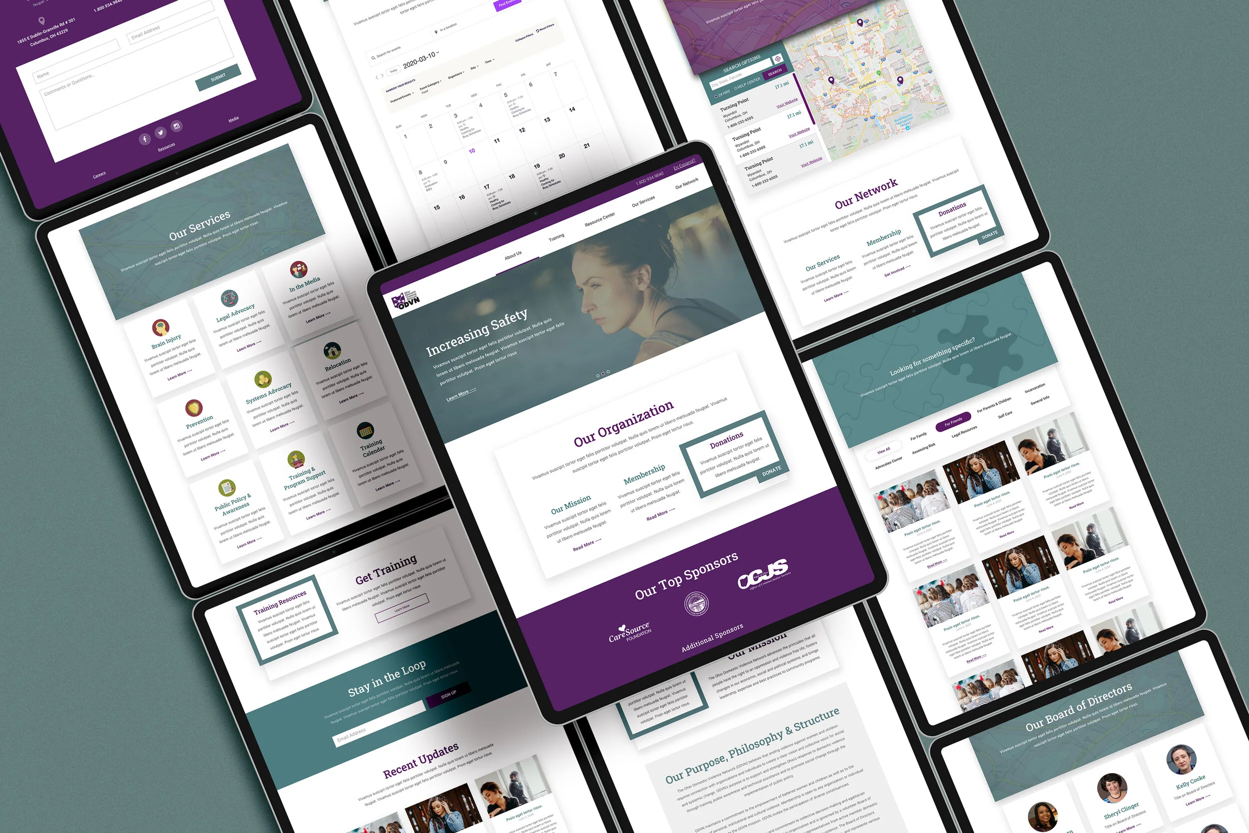
We got to work turning a maze into a structured & organized centralize hub of information.
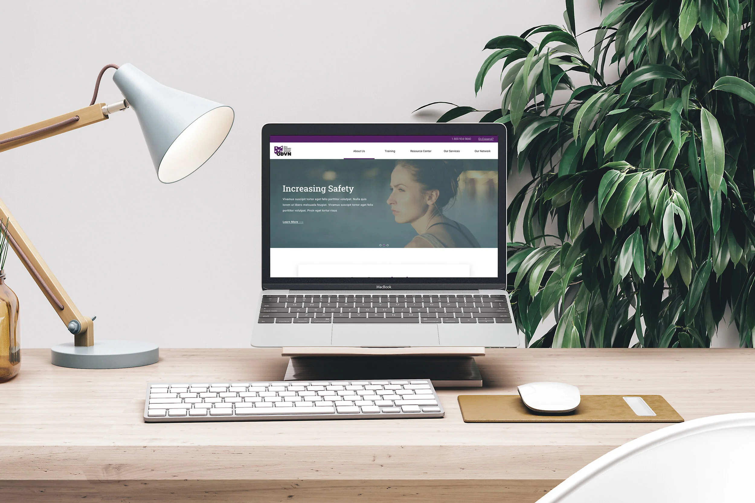
The goal was clear: every click should feel intuitive, every resource should feel reachable, and every interaction should feel safe. Using Divi visual builder for WordPress, the website was built in a way that’s both flexible for content updates and a delight for users to navigate.
The redesign wasn’t just cosmetic—it was strategic. By organizing information logically, highlighting urgent resources, and improving accessibility, the site truly supports the people it serves.
How users got better support when they needed it most.
Design isn’t just about looking nice—it’s about making life easier for the people who actually need your help. With ODVN, that meant putting users first at every scroll, click, and tap. Every decision was tested against one key question: Does this make it easier for someone seeking support, volunteering, or donating?
Here’s how that translated into real-world impact:
Immediate Access to Critical Resources: Survivors can now find guidance and support materials in under a minute, even on mobile.
Inclusive & Accessible for All: High-contrast design, scalable text, and clear labels ensure that the website is not just accessible, but welcoming. Users feel seen, safe, and supported.
Feedback That Fuels Change: The Safety Escape button helps users feel protected during an already vulnerable moment: seeking help.
By putting people first, we didn’t just redesign a website—we created a digital ally. Users feel guided, supported, and empowered, which means the organization’s impact is amplified and more help reaches more people.