Mobile-first website redesign that modernized digital outreach for the Columbus Metropolitan Library
Serving patrons from early readers to lifelong learners, CML supports education, workforce development, digital access, and community connection across all ages, backgrounds, and abilities. With a mission rooted in equitable access to information, the library plays a critical role not just as a physical space, but as a trusted public resource—one that must be welcoming, inclusive, and easy to navigate whether you’re walking through the front doors or logging in from home.
Year
2020
Client
Columbus Metropolitan Library
Role
UX Designer + Website Builder
Team
Project Team (Developer + Project Manager)
Problem
Connecting with the community through the Pandemic, from the comfort of your home.
The Columbus Metropolitan Library website had reached a tipping point. While rich in content and resources, the experience felt dated, dense, and difficult to navigate—especially for users with accessibility needs or lower digital confidence.
CML serves one of the broadest audiences imaginable: children, teens, parents, job seekers, seniors, and community members with varying levels of visual, motor, and cognitive accessibility requirements. The existing site wasn’t meeting users where they were, and critical information often required too many clicks, too much scrolling, or too much guesswork.
COVID-19 Response: addressing the pandemic
The challenge intensified during the COVID-19 pandemic. With physical locations limited, the website became the primary touchpoint between the library and its community. Unfortunately, many online-only resources were underutilized—not because they lacked value, but because users struggled to find or understand them.
CML didn’t just need a refresh. They needed a reimagined digital experience that felt modern, inclusive, and genuinely supportive.
Process
Before touching a single pixel, I focused on understanding the landscape—both the organization behind the site and the people actually using it. I led in-depth stakeholder and user interviews, paired with a competitive teardown and a full rethink of the site’s navigation, to make sure we were solving the right problems (not just the loudest ones).
The research told a consistent story: navigation labels that made users pause, pages trying to do everything at once, and a visual hierarchy that didn’t always know who should be speaking first. On the flip side, it also uncovered real opportunity—especially around making digital services easier to find and reinforcing CML as the modern, trusted community resource it already is.
Leading a comprehensive pass across structure, content, and accessibility
Stakeholder interviews to align on goals, constraints, and long-term vision—and surface a few assumptions along the way
A full content audit to flag outdated, redundant, or inaccessible content (because content debt is still debt)
An accessibility audit covering contrast, typography, navigation patterns, and assistive technology compatibility
Customer journey evaluations across key user groups, from first-time visitors to seasoned power users
A competitive analysis of leading library systems across the U.S. to see what the greats do well—and where they still struggle
A complete overhaul of the information architecture, starting with the sitemap and primary navigation—the bread and butter of how users actually find and use library services
Fewer cognitive speed bumps, better discoverability, and a structure designed to scale as CML’s digital offerings continue to grow.
Solution
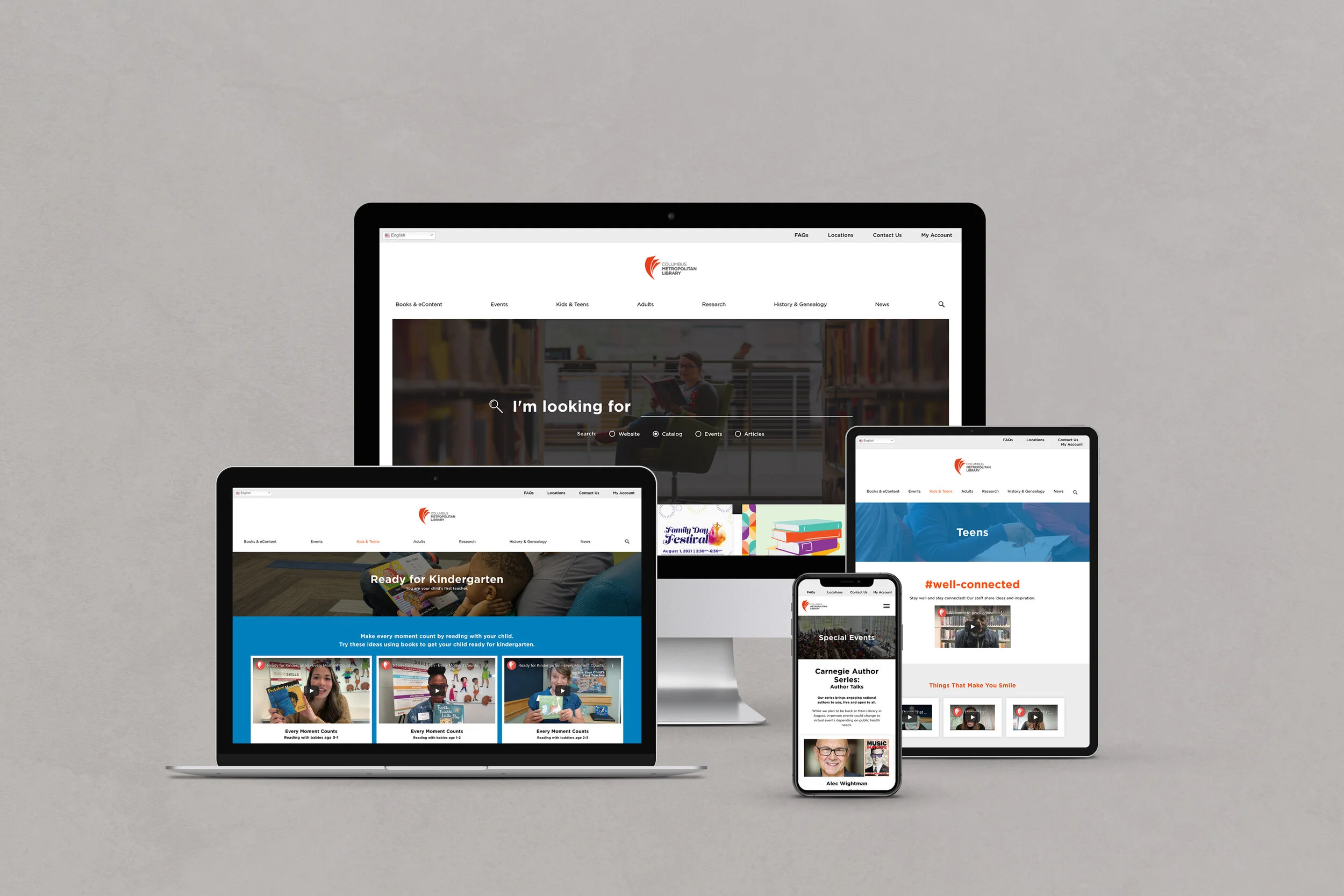
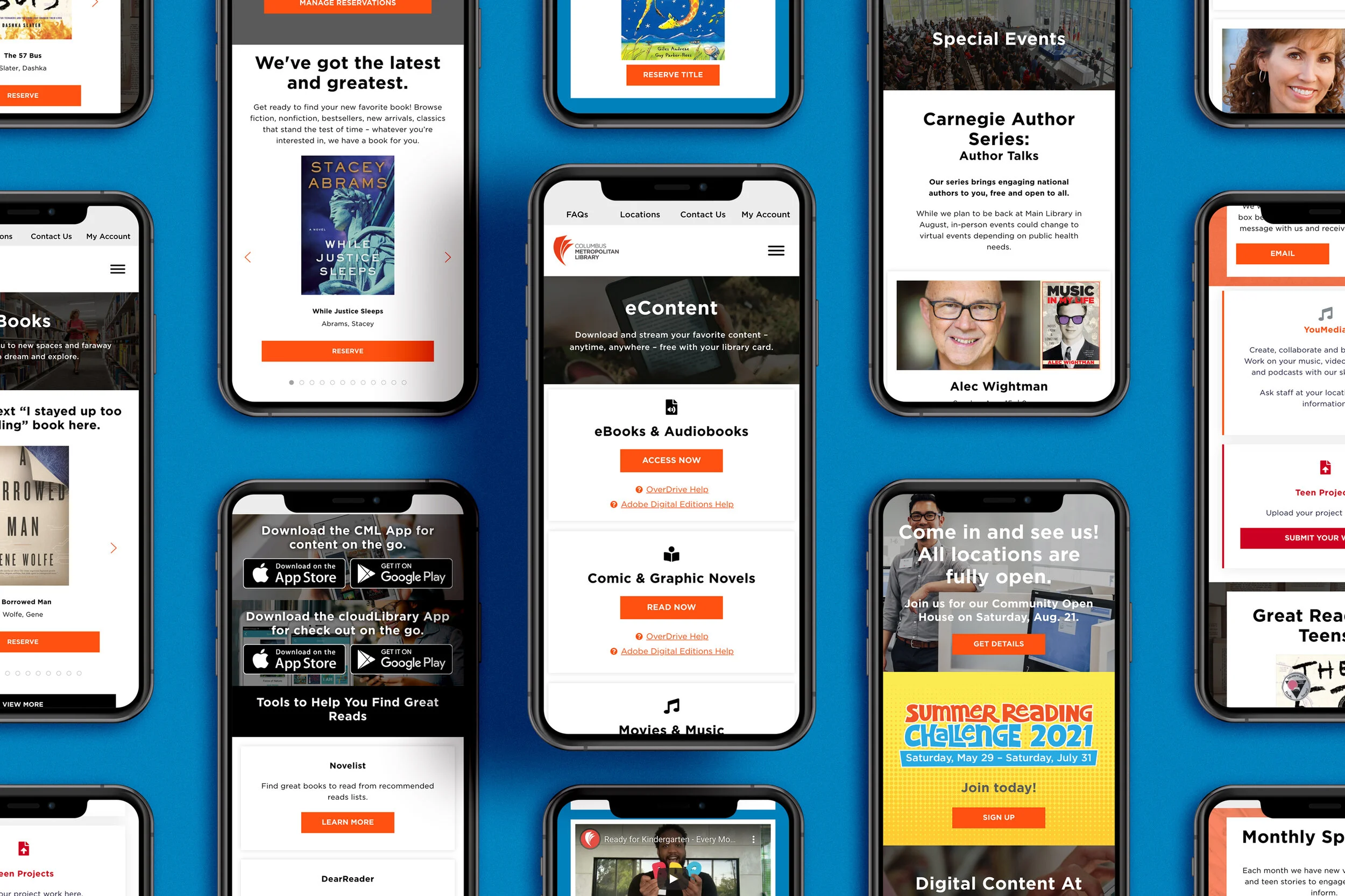
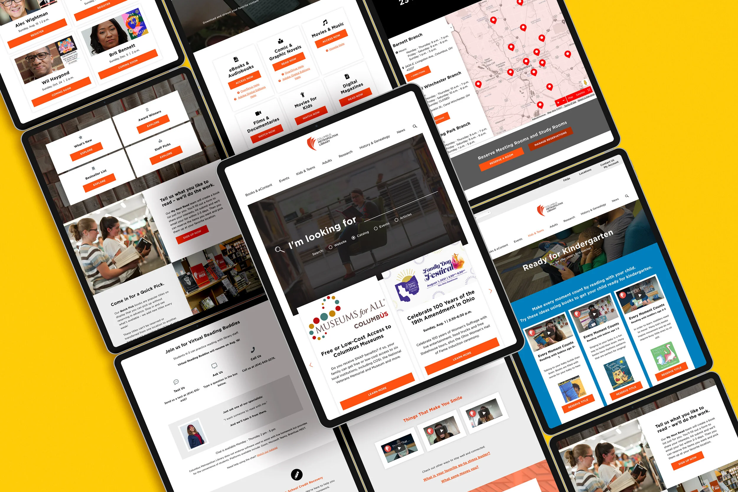
A digital library that shows up for its community
Rather than giving the site a fresh coat of paint, the goal was bigger: rethink how the Columbus Metropolitan Library connects with its community online. The website became a true extension of the library’s mission—meeting patrons wherever they are, on whatever device they’re using, and with whatever access needs they bring.
Accessibility was baked in from the start, not layered on at the end. Navigation was simplified, content restructured, and key resources surfaced intentionally to reduce friction and build confidence for users of all ages and abilities. Clear pathways replaced clutter, and digital-first services were woven directly into everyday journeys—making online resources feel just as essential as the physical stacks.
Delivering real value with post-launch KPIs & metrics
Task success & accessibility: How easily patrons complete core actions and engage with digital resources
Engagement & impact: Website traffic, return visits, and participation in virtual programs
Operational efficiency: Faster content updates through reusable templates and components
Resource utilization: Increased access to and downloads of digital materials
An experience that supports both quick visits and transformed the site from a static information hub, into an active tool for digital outreach, inclusion, and community connection.
Impact
The success of the redesign isn’t just measured in clicks—it’s measured in connection.
These metrics show how the site helps patrons of all ages and abilities find resources, engage with programs, and feel supported, while also making life easier for staff and more sustainable for the organization.
In short, the website doesn’t just look better—it works harder, strengthening the library’s mission one digital interaction at a time.
Overall
31.7%
Increase in Engagement
Overall