
Transforming the One-Key™ design system into a 90% efficiency engine
The One-Key ecosystem had a design system that technically existed… but only covered about 5% of the mobile experience. Designers were screenshotting old screens, rebuilding the same components over and over, and quietly creating UI chaos.
I led the effort to audit, built the system anew in Figma & facilitated moving the team over to the new platform; documented, and created a way to govern a fully functional design system across mobile and web. One that people could trust, reuse, and scale without side-eye.
The result: higher adoption, faster design work, better consistency, and way fewer “wait, which button is this?” and "woah where did that come from?!" moments.
Year
2021 - 2025
Client
Milwaukee Tool
Role
Design System Lead
Team
Solo
Problem
An incomplete system at scale that costed designer's time instead of saving it
As the product ecosystem grew, so did inconsistency. Buttons behaved differently, patterns multiplied like gremlins, and teams burned time solving problems that had already been solved somewhere else. Designers were frustrated. Engineers were frustrated. Users felt the seams.
The first-pass "sniff-check"
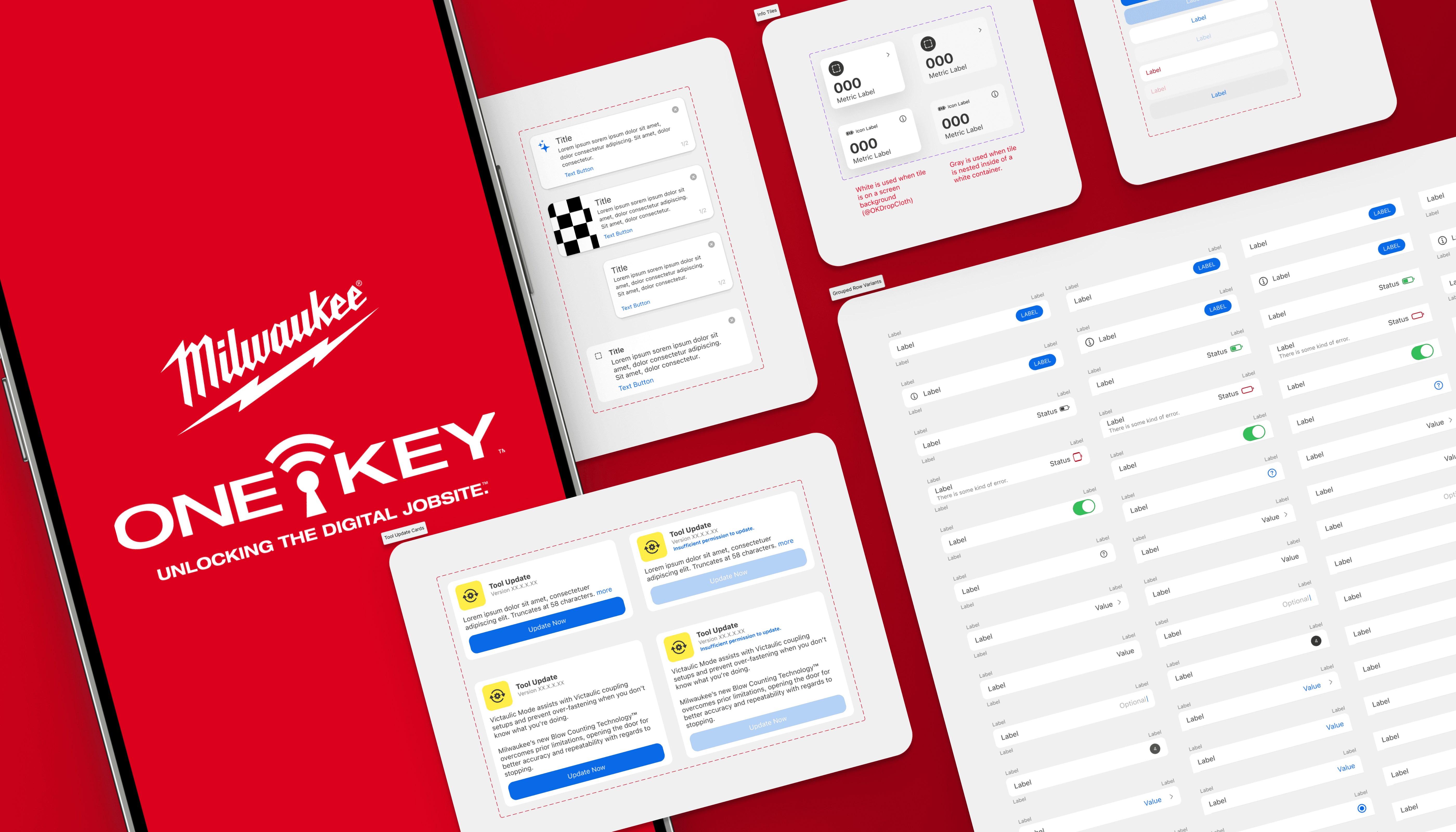
An in-depth, multi-platform audit showed many app experiences were more than 12 months old or considered legacy experiences, meaning the design system would need a full rebuild to establish the baseline of where the product would aim to target. The first step would be to align on needs, intents and overall structure of the libraries.
Native Components to reduce tech debt, align with platform standards, and prioritize the changes that mattered most. Some updates were quick fixes like accessibility improvements, while others took months to implement.
Accessibility was improved across the board, including adding accessible colors and better support for zoom and dynamic text.
Designer efficiency was also a focus. Patterns were reorganized for consistency, making it easy to switch between iOS and Android and quickly find, edit, or reuse components.
Finally: On to a fully recreated, scalable design system that works across platforms and saves designers time.
Process
By owning & leading the design system (v1.0 +), I partnered closely with other designers, developers, and DPMs as needed when UI updates were required or new components were being reviewed for accuracy—but ownership, accountability, and forward momentum lived with me. As other designers would work on new patterns, open discussions were had as a team during a newly set aside revolving stand up ritual before a final pattern would move over to the gatekeeper, (little ole me!) to restructure the components and then add them into the libraries with notations.
An Audit-Driven Rebuild: Creating a More Efficient, Scalable System
I kicked things off with component audits, stakeholder conversations, and a lot of pattern spelunking. The findings were clear: too many bespoke solutions, unclear ownership, and documentation that looked nice but didn’t help teams in the moment they needed it. These insights shaped a pragmatic, production‑first system strategy.
During the audit, I would aim to evaluate the system as a whole, but specifically focus on the insights we needed most to prioritize where to begin:
Identify gaps and redundancies
See where inconsistency was hurting usability
Prioritize the components that mattered most
Tie system work back to real product pain points
System Strategy
The design system was crafted to be modular and opinionated where it mattered most. Fewer components, clearer guidance, accessibility baked in by default, and flexibility where product nuance required it. The north star was simple: make the right thing the easy thing.
Collaboration without authority
By treating the system like a shared product—not a rulebook that dictates solutions & features—I was able to increase buy‑in and made adoption feel helpful instead of forced. Since joining the team in 2021, the team has gone from developers with no idea what the design system is—to now having developers advocating for consistency and pushing back when designers stray too far from the system.
Governance & Sustainability
As the Design System Lead, I created thoughtful contribution models, reviewed what the "definition of done" and "informed decision making" requirements would be for scaling the system, and established release cadences so the system could evolve without chaos. This ensured quality stayed high while still allowing teams to contribute—and also without creating design debt or fragmentation in experiences.
Solution
A scalable, documented design system that works
To save designers time and brainpower, I instrumented the design system by baking microinteractions directly into the system. Hovers, transitions, system responses—already there. Designers didn’t need to remember, recreate, or prototype every tiny interaction on every screen. The system handled the details so designers could focus on solving real problems, not re-animating the same button or switch for the hundredth time.
The design system was split into clearly defined libraries to make wayfinding fast and intuitive by organizing it into:
Tokens and foundations
Core components
Platform-specific patterns
Templates for common workflows
Instead of one massive library, I created focused libraries that aligned to real use cases while still sharing a common backbone.
Flexible enough to scale. Opinionated enough to stay coherent.
Awe yeahhhhh, the results were excellent!
Faster onboarding, less second-guessing, and designers landing on the right patterns faster—which is exactly what a design system should do.
Impact
Fewer headaches, faster shipping & driving unbelievable consistency.
After the 90 day monitoring period, there was an astonishing number of pattern insertions that designers were using in their current and active workflows, with great success in also making designers more efficient in their work.
Cohesion
More consistent UX across platforms
Adoption
~65%
across core workflows
Efficiency
~91%
increase in designer efficiency
Systemic