True Citrus: A simple but effective redesign

True Citrus is a consumer brand focused on simple ingredients, repeat customers, and everyday habits. As the company grew, it became increasingly important that the website supported those goals—clearly communicating value, encouraging subscriptions, and making purchasing friction-free.

Year

2020

Year

2020

Year

2020

Client

True Citrus

Client

True Citrus

Client

True Citrus

Role

UX + Web Designer

Role

UX + Web Designer

Role

UX + Web Designer

Nothing was catastrophically broken—but the site was quietly leaking revenue.

Nothing was catastrophically broken—but the site was quietly leaking revenue.

Nothing was catastrophically broken—but the site was quietly leaking revenue.

The data told a familiar story: short visits, abandoned carts, overlooked subscriptions, and mobile users bouncing early. The site wasn’t confusing enough to cause frustration—it was confusing enough to quietly lose conversions.

Baseline performance told the story:
  • Short average session times, especially on product pages

  • High cart abandonment at key checkout steps

  • Low visibility and understanding of subscription options

  • Mobile users bouncing faster than desktop users

  • Navigation friction causing early exits

Users weren’t confused enough to complain—but they were confused enough to leave.

A yellow themed lemon powdered drink mix product page.

Attack the costly leaks first—the places customers love to escape.

Attack the costly leaks first—the places customers love to escape.

Attack the costly leaks first—the places customers love to escape.

The existing website was built on older code and design patterns, which led to subtle—but expensive—problems across the user journey. Nothing was “broken” enough to trigger alarms, but together these issues added up to lost conversions.

The biggest offenders:

  • Confusing navigation that slowed users down and increased drop-off

  • Short session times due to low engagement and unclear content hierarchy

  • Cart abandonment caused by friction in the shopping flow

  • Subscription signups buried or under-explained

  • Mobile usability issues that made quick purchases harder than necessary

The site was doing just enough to function—but not enough to perform.
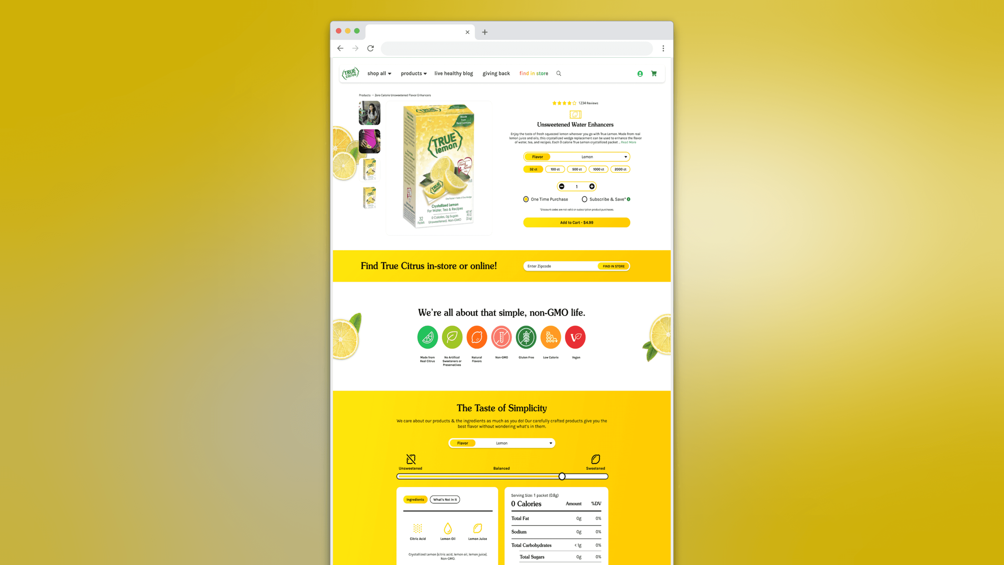
Same site, smarter UX, in budget & on time.

Instead of recommending a full rebuild, the proposed solution was a cost-effective refresh, that reused the existing framework while strategically upgrading the parts that were hurting performance.

By reviewing long-term analytics, studying e-commerce usability patterns, and working closely with the client, changes were identified that would have the biggest impact on revenue—without unnecessary development hours.

The approach focused on:

  • A visual restyle that modernized the site without touching stable backend systems

  • Streamlined navigation to reduce friction and improve session depth

  • Targeted custom development to smooth out the cart and checkout experience

  • Clearer subscription messaging and placement to drive recurring revenue

  • Mobile-first usability improvements where drop-off was highest

This allowed us to correct long-standing issues while keeping costs down and timelines tight.

Rejuvented Brand Story

Color that speaks

Color theory was leveraged to align every hue with True Citrus’ natural, fresh brand story—making the website feel more vibrant, authentic, and in tune with the product itself.

Refined & structured navigation.

So customers stop getting lost along the way.

We reorganized the extensive product catalog into a clear, intuitive structure—helping users find exactly what they want without the mental gymnastics.

Integrated User Generated Content (UGC)

Real people, real flavor.

Incorporating user-generated content throughout the site emphasized the lifestyle aspect of the product, making the experience relatable, social, and aspirational.

Simplified User Journey

No more dead ends.

By identifying and repairing broken feedback loops, we prevented users from hitting frustrating dead-ends—guiding them confidently through every step of their journey.

Overall UI Refresh

A fresh look for a fresh brand.

Updating visuals with a modern aesthetic made the brand feel contemporary, vibrant, and appealing to a younger audience—while elevating overall perception.

Rejuvented Brand Story

Color that speaks

Color theory was leveraged to align every hue with True Citrus’ natural, fresh brand story—making the website feel more vibrant, authentic, and in tune with the product itself.

Simplified User Journey

No more dead ends.

By identifying and repairing broken feedback loops, we prevented users from hitting frustrating dead-ends—guiding them confidently through every step of their journey.

Refined & structured navigation.

So customers stop getting lost along the way.

We reorganized the extensive product catalog into a clear, intuitive structure—helping users find exactly what they want without the mental gymnastics.

Overall UI Refresh

A fresh look for a fresh brand.

Updating visuals with a modern aesthetic made the brand feel contemporary, vibrant, and appealing to a younger audience—while elevating overall perception.

Integrated User Generated Content (UGC)

Real people, real flavor.

Incorporating user-generated content throughout the site emphasized the lifestyle aspect of the product, making the experience relatable, social, and aspirational.

IMPACT

Good UX isn’t about bigger budgets—it’s about better decisions.

Good UX isn’t about bigger budgets—it’s about better decisions.

Good UX isn’t about bigger budgets—it’s about better decisions.

By restyling the existing site and investing in a few targeted development updates, True Citrus was able to improve engagement, reduce friction in the purchase flow, and set the stage for stronger subscription growth—without the cost of a full redesign. Sometimes the best solution isn’t starting over. It’s knowing exactly what to fix—and what to leave alone.

37.4%

Increase in session length

27%

Reduction in cart abandonment

15%

Increase in email marketing signups