

Reducing user friction with correcting data inaccuracy & reducing false service tickets in an Enterprise mobile app.
ROLE
User Experience Designer
COMPANY
Milwaukee Tool
PROJECT TYPE
Multi-Platform
Milwaukee Tool®’s Bluetooth Equipment Tracking Tags were first released to the market in November 2021, with resounding praise from One-Key™ users. The product would enable them to more accurately tracking the GPS location of an item saved in their inventory of tools.
Some background.
While the release of the product was successful, over time customers began submitting tickets to service with repeated issues involving the coin cell battery of the device.
Plenty of service tickets that were being submitted for the devices were specifically regarding batteries arriving dead in the box, or not lasting as long as advertised.
On average 35% tracking tags were being reported as dead or in need of service, which meant many more service hours wasted on something that wasn’t really ready for service. This would lead to excess cost on the company’s part in addressing falsely reported issues.
After some investigation with developers, it was determined that some small issues could be addressed and changed to make the data flow into the app more accurately, while also enabling users to get more targeted alerts based on the status of the device.
After additional extensive user feedback was provided, it was also discovered that users were experiencing issues in trying to location a retailer to buy new devices from. Due to the device type, many users owned multiple tracking tags or would need multiple units. In addition to being able to better understand the status of the device, users needed a better way to inform themselves on errors with the device and how to fix—or where and how they could go about purchasing the replacement items. This new enhancement would replace an old experience that directed users to a non-functional webpage with just information on the devices, but not how to buy.
How do inform users more accurately, without overwhelming them with education, data and alerts?
What’s the root of the problem?
UNDERSTANDING THE HOW & WHY
Before beginning and exploration, technical leads were brought in to understand the very root of the coin cell issues.
Since it was already known that the issue was likely in the firmware, developers on iOS, Android and Web were brought in to understand our options with the firmware.
What changes could we make, as once firmware functionality is established, there is usually no room to add anything new until the next generation.
Correcting data inaccuracy.
There were several issues that needed to be tackled solely in the back-end of the product that would bring about a more accurate experience for users—but with limited control over firmware, the options would be very limited in how we could surface a solution.
By targeting the easiest approach, we leaned on the actual data itself to better inform the user. After extensive investigation, developers uncovered that with the small adjustment of modifying the battery charge ranges in which we display a battery status (Good, Poor, Dead), we could make the alerts more closely match the actual value of the better—thus notifying less users, and also notifying them at the right time when a problem exists.
On the front-end of this solution, there would need to be some visual representation of messaging that would also answer any questions they have about the status being shown.

The first thing to be addressed was aligning the battery charge range to exact percentage brackets that we needed the user to understand the state of.
Formerly set at 50%, the threshold for notifying users they should take action was lowered to 25%, to ensure we still notified them of the issue well before it became critical.

The second thing to address was what happens when the status of the coin cell battery has reached a critical point—meaning the tracker can not function any longer.
At this state, it needed to be made explicitly clear that they could not use the device until it was either serviced or replaced.
Conditional highlighting was added to showcase urgency with green, orange or red supportive text.
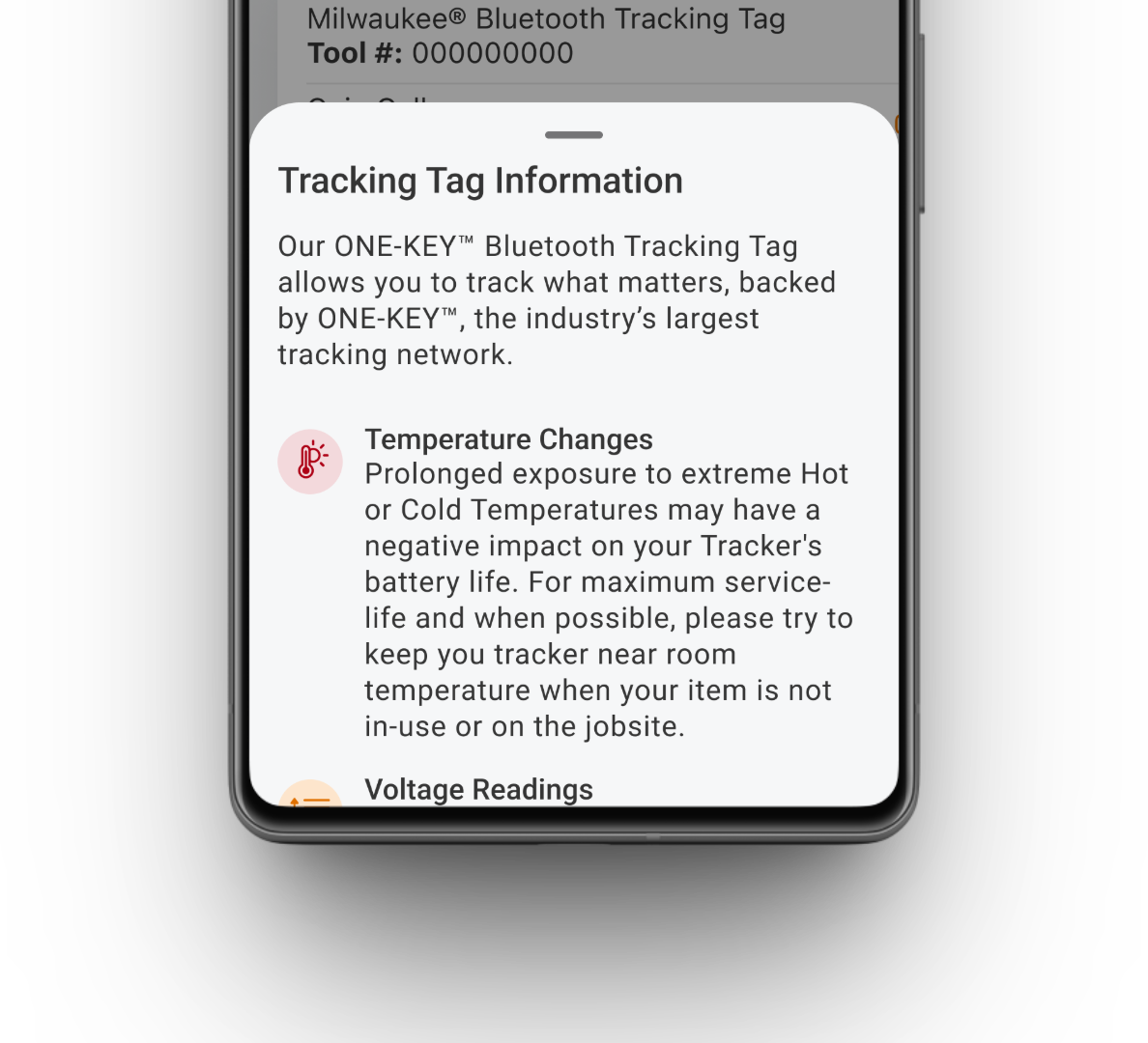
In-App Education
The focus started with documenting and aligning the individual scenarios of the battery itself.
When would the battery stop working? What if it was baking in the sun in the Arizona heat all day? What if the equipment tracking tag never reported back its’ location?
To solve for making sure users could understand each of these situations that could trigger an event, a non-intrusive education pattern was utilized.

Conditional Alerts
The next need was for a conditional alert that would provide users with a direct path to purchasing a product, and finding all the information they needed to move forward with replacing an aging or dead unit.
Each state of the alert would help the user understand which scenario they might be in, connecting back to the education pieces.

Clear Path to Purchase
With the help of an existing sales technology being utilized within the company, we were able to embed an API that would allow users to select which retailer they wanted to purchase from, then display a conditional button that takes the user straight to the product listing results or individual retail item on the applicable retailers website.
This solution provides them with time saving interactions—reducing the time it took to get from the Item Details screen to the retailers website & finding their product to purchase by 75% on average.
REDUCING CONFUSION
To ensure users could problem solve the issues with their device, education and replacements needed to be conditionally seamless.
Splitting this next phase into 3 unique focuses would enable the restructuring of the schema used to inform users of state and condition changes, in a way that was much more accurate and informative for users at all points of the product lifecycle. This context would enable users to see less of the wrong type of notifications, and more of the troubleshooting and replacement details that formerly were unavailable.
WHERE WE STARTED
35:100
On average, 35 out of 100 devices were being reported for service when they had around 30-0% of battery life.
⟶
HOW IT SHIFTED
5 : 100
After the voltage range & UI changes, only 5 out of 100 devices were reporting a “Dead” status on average.
60%
HOW DID WE DO
High value success, with a low effort & targeted solution.
The double sprint-worth of design and development that went into this work ended up yielding far better results than initially assumed—which meant we had been incredibly successful in finding a solution that addressed the number of false-reporting devices, by better informing users and refining the data set.
A 90 day monitoring period of overall service tickets for Bluetooth Equipment Trackers would utlimately reveal how well we could measure the success, and the numbers were astounding.
Within the first 90 days
BIG RESULTS
There was an immediate reduction in the number of BLE Equipment Trackers that were being reported to service in need of a new battery, or not connecting with the app due to the battery level. This huge decrease in service tickets would save the company thousands of dollars of cost to replace otherwise working BLE Equipment Trackers well before their prime—and opening up the capacity for the service center to focus on more critical service needs.