

Creating a new way to experience heated apparel, with a temperature that’s just right.
MY FUNCTION
Product Designer
COMPANY
Milwaukee Tool
PROJECT TYPE
Multi-Platform Mobile App
As an industry-beloved brand, Milwaukee Tool has afforded the construction industry with tools built with quality, to last even the toughest of jobsites. While the One-Key™ mobile app is focused around the tool inventory and reporting experiences of managing your collection of tools; this left a gap for users who utilized products meant for being in the physical world.
Rather than attempting to implement a completely different way to us our existing digital products, Heated Gear becomes it’s own app experience.
The ask was to provide a minimum viable product to launch to market, at the same time as the new heated apparel collection, but it had to afford users the ability to remotely control their products and save customization without the user of a gated user account.
A little background.
Due to the complexity of needed to maintain a way to store user data, like account information or specific product details, Heated Gear had to be treated much different from the One-Key™ experience.
The new product would allow users to connect via Bluetooth to a smart enabled battery pack that could communicate with both the local storage of a users’ phone and a mobile app on both iOS and Android. With limited ability to store user data, it would pose some issues with how users would also be able to customize settings and also saved settings to be used later.
This would mean the app would need to be implemented differently than the other mobile apps, in a way that would allow them all the same usability as someone with a user account. Due to the hyper-targeted focus of the app being around the control of a single type of device, a headless CMS would give the organization the opportunity to have better scalability & reusability in the product while also keeping all content in a unified content hub. This not only gave the product plenty of room to grow as the product line expanded, but it would aid in sustainability by utilizing slotted or nested components, that have a variety of states and variants to cover a very broad range of data visualization needs.
Where to begin.
A fresh perspective.
PROOF OF CONCEPT
A New Product Development project often has constant changing priorities and conflicting opinions of what “ideal” looks like.
Since this product was, at it’s core, an NPD product they company had never launched before (the battery itself), extensive User Research was done to validate an initial proof concept for overall functionality and user preference of the different ways they’d like to be able to control their devices. The research and ideation took place over the course of one calendar year, to allow for both in-person and remote user testing.
With cold weather being an unfortunate part of the seasons in the construction industry, having a product that keeps them comfortable makes this product particularly advantageous for workers to have. If done well, it would also cause less distractions to workers in the field trying to physically use the product, thus keeping them safer.
What Users Needed
After completing multiple rounds of interviews with 3 different persona groups of users (General Consumers, Crib Managers/Administrative & Small Contractors), there were some very common themes that would point the way to an effortless experience that wouldn’t impede their day-to-day.
01. Heat Levels
Users wanted to adjust the levels of “toasty” (if you will), to ensure they were not too hot, not too cold….but just right.
02. Heat Zones
Users wanted to be able to turn certain areas of the apparel item on or off, to focus heat towards the exact areas they wanted.
03. Runtime
Users wanted to be able to optimize the battery to run for set periods of time, so the battery pack would automatically shut off after a set period of time (run for 4 hours at set heat level, but possibly dying before that timeframe)—or it could maximize efficiency to set the heat level based on how long you want the apparel item to run for (set to run for 4 hours, with maximum amount of heat that would allow the battery to run for 4 hours).
04. Battery Health Monitoring
Users wanted to understand the health of their battery usage, whether it was about to run out or if they had more time left. This meant the user would need to be presented with multiple ways variants of data utilization pieces, which would include formats for each setting type.
Turns out platform users are really particular about how they want to control their products.
LET’S TEST IT
The first piece of the puzzle that had to be figured out was the actual way a user would interact with the battery itself, in the app.
Users would have to be able to perform several key functions to successfully utilize the product, and this also meant educating the user on how to best use the product for their needs.
The complexity of multiple combinations of settings would also mean multiple types of data to display based on the unique user scenario, and multiple ways in which an error state could be triggered.
-
Since the app required both location services and Bluetooth access to function, the onboarding for this had to change to perform an educational function and a systematic function to ensure the product could find the mobile app.
-
In order to customize the product, it needed to be paired via bluetooth in a step-by-step process to guide the user through putting the battery in broadcast mode so it would be found.
Once it was paired, users could have the option of naming their battery something custom for their needs, like keeping batteries organized or assigned.
-
Each battery that was added would be remembered by the Bluetooth connection and recognized later when it was put into active mode.
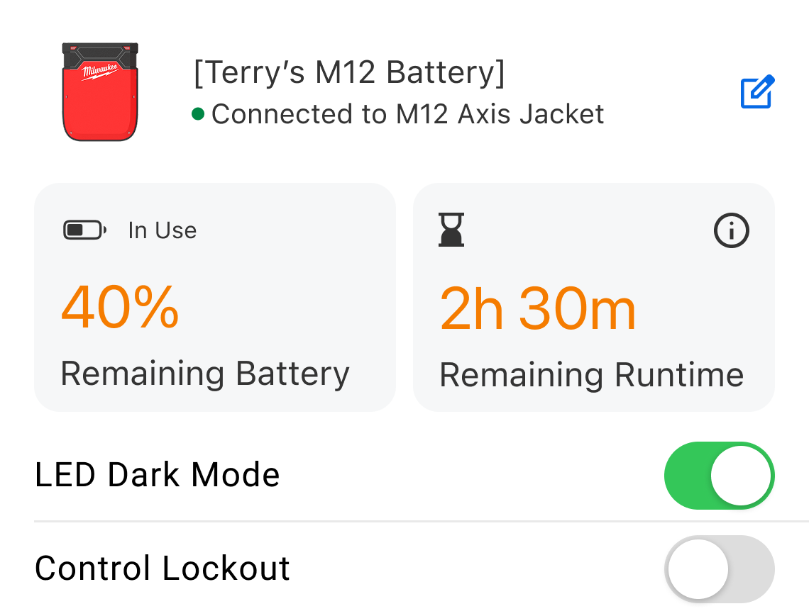
In order to customize each battery, it would have a multi-state dashboard screen that would house the data utilization for the battery consumption, the current battery status, current battery charge, 3 types of battery controls and the battery library that would house saved presets.
-
Each battery would have the option to direct connect for controlling the apparel item without having to even touch it.
This meant users needed to be able to power the item on & off, lock the physical buttons on the battery & item, and turn the LED screen on & off.
To make the most usable experience, extensive testing was done to validate the best way to give users control how they wanted it.
Users always seem to surprise me when I least expect it.
After the testing was completed for the battery control functions, users on both platforms actually resonated with the same pattern for how to do things like turn the battery on and off.
But what was even more surprising was how 85% of users said that they would want the same controls for a their smart watch or something like a widget to make it easy to interact with.
At this point, none of the digital ecosystem had ever included a widget or a smart watch app. There was no research into that specific functionality, but users on both iOS and Android said it would be a positive impact on their use of the product if they could control some things without opening the app at all—or having a shortcut to do something for them.
Now that’s really interesting…challenge accepted.
Guess I was about to dive into the world of really, tiny experiences.
iOS Complications
Since users really wanted to be able to know how much battery remained so they were always prepared, a battery complication on the lock screen for iOS would allow them to view the battery level of the currently connected battery—with just a glance to their lock screen.
LET’S TEST IT
Interactive Widgets
The primary goal for the widgets was to inform the user of the current settings of their device. With Android having fully responsive widgets at the time, more than 18 sizes of widgets were created to best offer the user the variety for it to fit into their personalized screens of their phone.
In a very small footprint, the widget had to be able to communicate which battery was connected, current settings, current charge, remaining runtime, and the ability to power the item on and off.
63%
of users said they would be most likely to use a mode where the battery could optimize itself to run for a set period of time, like a shift. Users could then plan around consumption needs and ensure their battery either lasted all of their shift, or they could have multiple batteries charged and ready to maximize their settings to their shift lengths.
PHASE II
How do our users expect to have control over their product? What sort of control style best fits their expectations?
The second phase of testing would be centered around the digital control of a physical device. It had to be simple to understand for users to engage with it, but also intuitive enough to education users who struggled with digital experiences. The potential solutions were inspired by looking at more than 27 digital connected product experiences that ranged from smart lighting to security system hubs.
What surprised me most was how unexpected the preferred solution was, which was so different from the feedback received initially. Users really leaned towards a type of interaction that we didn’t usually utilize in our other digital experiences.
Understanding Control.
But does it save?
The first step to creating a usable and interactive experience, was to understand how users thought they should be able to control certain types of settings. What sort of things resonated with them that translated the function of physical buttons into a digital experience?
Since most users initially indicated they wanted a way to determine which heat settings to apply to which zone of an item, the beginning of testing would focus on how the user could success select both a zone, and a level of heat attached to it.
60%
of users selected Option 1: Low, Med, High Slider

40%
of users selected Option 2: 1-10 Level Slider

The secondary function of focus was the way in which a user could save a setting profile as a saved preset in the Preset Library.
This functionality was considered both a “Nice to Have” and a “Critical Launch Item”, because while it didn’t prevent a user from using the app or controlling the battery, the convenience aspect of the features was of critical use to users.
There were endless options for ways to change settings, and three strong options for how a user might be able to successfully save their settings without friction.
For testing, 3 different functional settings controls were tested, in order to understand how our users would prefer to change their settings, and what the best saving functionality would make the process the most efficient.
Option I
The first option most closely utilized native patterns for the slider functionality. For option 1, we also looked at whether users could understand there were 10 levels of heat one could apply to their heat zones. It also featured a primary “save to presets” button and a secondary conditional button for applying changes manually.
100% of users were successful in saving a preset with these controls.
100% of users also said that the usability of the saving preset experience was “Easy” or “Very Easy”
Option II
The second option evaluated a simplified slider that would only provide low, medium and high markers, testing whether users even needed to know whether there were 10 levels or just relative assumed level of heat. It featured a primary “apply changes” button, moving the saving of the preset to a secondary position—we wanted to know how important the save function was in the users’ mental priorities.
100% of users were successful in saving a preset with these controls
80% of users said that the usability of the saving preset experience was “Neutral” in terms of usability, while 20% said it was complicated.
Option III
The last option looked at a completed different type of method for changing heat zones. This one instead opted to use a row-based menu, that when tapped would open a pop up menu to select a value of 1-10 for each zone. This option removed a primary save the presets in button form, and instead looked at whether the save function could be more efficiently used as just a quick-tap icon.
100% of users were successful in saving a preset with these controls
40% of users said the usability of the saving preset experience was “Neutral”, 40% said it was “Easy” and 20% said it was complicated.
“While users mentioned that the experience for the save functionality schema was complicated, they provided the most positive feedback about the simplified slider in Option 2. This would be the slider to move forward with while we re-evaluated the applying of changes to settings functionality.”
Smart Watch App
To partner with the widgets, a smart watch app was designed that would allow the user some pairing abilities & customizations in a limited functional app. Ultimately it was decided this aspect of the product would not make it to this current years’ product line.
Third time is a charm. So we tested controls & functions thrice.
Since none of the other products in the ecosystem included a directly connected & controlled product the way the Heated Gear app did, extensive testing had to look at the individual controls in which user would lean on to customize the settings.
Testing for the unknown.
The testing was broken out into 3 phases that would gradually drill deeper into the unique aspects of each type of setting.
Phase I
Initially the need to understand how users would expect to have control over the battery drove the testing towards generic patterns for controlling an undisclosed device. This would begin to reveal what users would expect and understand from a connected product.
Phase II
Next, testing centered around the saved presets functionality that would enable them to customize and save their settings to be used later. The users were offered up a series of A/B tests for different looks for the defined controls they would have to use while gauging whether they understood what the controls also did and if the iconography matched their expectations.
Phase III
The final phase of testing looked at the schema for the saving and applying functionality, as well as the defined the user scenarios that could trigger different states of the connected product. Each state would need to be easy and simply for users to clear without issue. Users needed to understand that not only could they save presets, but they could name them and apply them from the library.
81%
PHASE I
What are the critical functional features that users will expect to have with something like this connected product?
With this product being one of the first fully controllable connected products the organization had released, users had to help inform us on how they expected to be able to use the product, both physically and digitally. This meant shifting the focus away from storing an inventory of products, to storing a collection of products that were interchangeable. This was a type of control the digital ecosystem had not needed yet.
This critical point of the research started to paint the picture of what our users saw in their brain, of how they’d control the physical product, digitally.
100%
of users wanted the ability to save different settings that they could come back to an apply easily later on. A chief reasoning for this was that it took time to meddle with the buttons on the apparel items themselves, making them have to stop what they were doing every time they had to adjust settings when the weather changed.
of users wanted the option to have smart phone widgets. A big driving factor behind this was due to the users’ needs to not have the product impede their ability to do their job. Having to unzip a jacket pocket to touch a battery, or having to fully pull out a mobile phone & use it, would mean time and safety impacts. A smartphone widget could get them easier access to what they need, faster.

PHASE III
How do our users expect to have control over their product? What sort of control style best fits their expectations?
The second phase of testing would be centered around the digital control of a physical device. It had to be simple to understand for users to engage with it, but also intuitive enough to education users who struggled with digital experiences. The potential solutions were inspired by looking at more than 27 digital connected product experiences that ranged from smart lighting to security system hubs.
What surprised me most was how unexpected the preferred solution was, which was so different from the feedback received initially. Users really leaned towards a type of interaction that we didn’t usually utilize in our other digital experiences.
Visual Representation.
The last pieces of testing for Phase II included looking at the digital equivalent of the physical control buttons on the product, as well as icon recognition.
The app would need to be able to power the device on and off, switch the connected apparel item into manual mode from the battery, turn off the on-device LED screen and lock out the controls of the battery to avoid accidentally settings changes while users are actively working in the field.
Two options were explored to look at how easily users could identify the purpose of each setting, and whether the icons visually represented things the way we needed.
Option I
The original idea was to have digital representation of actual buttons, using icons from the product itself to represent the controls. While we believed this would be the ideal solution, users surprised us in the end when 87% didn’t understand what the controls did.
Option II
This option really leaned into the path of least resistance. By utilizing a completely native pattern in both iOS and Android, users more easily understand that the device was having a change on the physical battery, and better understood what they did. Overall, 91% of users said they preferred this option.
Validating the final controls.
Because the preferred pattern involved the power button being removed from the rows, a control bar was explored to look at the best way users could change the mode and turn their device on and off in the same place. These two functions were originally ranked as the top two things users wanted, so nailing the right pattern was essential to success.

Control Bar
The second option looked more closely at commonly connected products, like smart lighting, and how themes emerged in what users expected for controlling basic functions like power on/off. This option focused on making the bar feel more like it’s part of a dashboard for controlling a device. 88% of users said they understood the purpose of the bar and it’s direct connection in controlling the app connected battery.

Icon Recognition
Since this product was completely new, icons were validated as part of the process. This important step would help us ensure that users understood the settings from an at-a-glance view.
Bottom App Bar
The second option played off of Material 3 components for the Bottom App Bar, that features a floating action button. This option explored if the save and sync functionality should be part of the core functionality of custom settings. While we believed this would be the ideal solution, users surprised us in the end when 83% didn’t understand what the controls did between changing modes or syncing the device. The most common comment was that they didn’t understand the icon.
WIDGETS & COMPLICATIONS
How do we put control of the battery in their hands in the quickest and most efficient way possible, without distracting the users from their work?
On both iOS and Android, Widgets offer users the ability to customize aspects of the their experiences to their values and needs. Since a connected product typically works in the background with latent activity, creating a smart watch app and widget companion become a complicated issue.
Due to how Bluetooth connects to their mobile devices, the battery would frequently disconnected from the phone and leave the widgets in an empty state or inactive state. To avoid this experience seeming like a first-glance failure, an instant refresh function was built into that app so that users could request the battery to send an update.
Establishing User Preferences.
Due to the broad range of users that our product appealed to, there was a need to establish a baseline of specific features users really wanted to have. While we would have loved to create every single “Nice to Have” feature, it was determined in the first wave of testing on the widgets and smart watch apps, that not enough users felt they would find value in them. In the end, only around 45% of users mentioned that a smart watch app would be beneficial to their day-to-day, as not enough of them even wore a smart watch on the job.
With the focus now shifting fully into widgets, testing would need to be complete to ensure the right combination of data visualization & item information was present. Users helped to direct the final selection of widgets and open our eyes to the need for Complications for iOS users exclusively.
The complications would provide users at-a-glance battery charge information right from the lock screen of their phone. By being able to simply wake up the lock screen and see the complication right away, users wouldn’t even need to pull the battery pack out of their apparel item or unlock their mobile device to check a battery level.


WHAT USERS HAVE SAID
Looking back at the past year since the app was released, some of our users had some excellent things to say!
“Milwaukee finally announced a smart battery solution for their heated gear line after years of users complaining about the terrible M12 battery solution...The app is simple and shows the battery percentage in an easy layout with all your batteries up front with each having their own tile and control...It's very intuitive and easily to turn on and off areas in your Hexon garment with simple taps on the control panel within the app. Overall, nice job Milwaukee. They designed an excellent app.”