
Building an Enterprise Design System that Scales to a Digital Ecosystem
MY FUNCTION
Design System & UX Designer
COMPANY
Milwaukee Tool
PROJECT TYPE
Enterprise-Level Design System
The popularity of the Milwaukee Tool One-Key™ mobile app soared as quickly as it was able to scale to current user needs. As time went on, reusable pattern libraries became a very critical need for the design and development teams—and users were beginning to notice inconsistencies within the app.
A little background.
While the fact that users noticed some things in the mobile experience didn’t look quite right or match what they expected, it wasn’t the biggest issue there was to address: proper documentation. There was no source of truth for the developers to reference for evergreen components that we use every day, and there wasn’t documentation for the new components being created—just whatever the designer provided in the project files. If designer files were chronically incomplete or inaccurate, how could designers or developers do their job efficiently, without having to recreate countless screens-worth of patterns for every project?
A component library had existed initially in Adobe XD, but only represented around 5% of the overall mobile experience. It included a small portion of iOS, which had been around longer than Android, and much of the Web App experience. It wasn’t routinely updated or maintained because there was no team or process in place to manage such a structure, and existing documentation hadn’t been properly updated in quite some time. A complete lack of an Android pattern library left a complete gap in our understanding of how the brand flexed across the platform.
So now what?
That might be problematic.
START SOMEWHERE
Turns out building a design system for 3 platforms, with nearly no documentation…is absolutely awful.
Initially, this effort was considered a likely failure (in the form of an impossible undertaking) from the start, simply because there was no one with the experience or know-how to build a design system—let alone what it meant to make it scalable. The team knew we desperately needed something the bridge the gap—so it was time to accept a very complex product issue.
A quick audit of the apps showed that some of the experiences in production (and users’ hands) were created with no designer involvement, or designers haven’t worked on them in even the recent 12+ months. After an analysis of what existed to-date, the challenge became having to start from scratch.
Seizing the opportunity of unexpected changing priorities, a new iteration of the library with a heavier touch of native experiences would be possible. Some of the changes required months of implementation that might have to be snuck into another scoped project, while others were single sprints of accessibility adjustments, for example.
What purpose does it serve?
A well-aligned design system would provide a baseline for the product with routine updates; effectively tracking back changes to the system over time through semantic versioning. It would give more insights into how often we are revisiting specific components, if there’s a usability issue we keep running into; or if we are adding a high volume of new patterns to the library, where was it falling short already that so much was still being added?
To better address the existing gaps in the design system, the scope of the effort was broken apart into a few common themes to refine:
Platform-Specific Native Experiences
Stripping out old custom development and replacing with native components.
Attempting to implement native solutions as often as possible, to cut down on tech debt for low value experiences.
Adjusting global styles for native platform-preferred styles.
Making tradeoff decisions with developers on which changes were the most important and critical to a cohesive experience, vs. ones that would make lesser impact.
Accessibility Principles
Making note of where the worst accessibility issues existed in the app and correcting them—like adding an accessible color to the brand palette to allow better use of iconography.
Adjusting global styles for accessible zoom features and dynamic text styling.
Designer Efficiency
Patterns needed to be organized consistently, so designers have no issues wayfinding to what they need.
Designers could switch between iOS and Android patterns without friction.
General use of a more complete design system should drastically cut down the time it takes them to complete a existing experience in-app.
Everything must be fully recreated, editable and customizable.
Version 1.0 was actually a failure.
HOW UNEXPECTED
The first iteration of the design system was truly successful in getting all of the design team over to utilizing Figma as the design tool of choice. However, it was quickly realized that the components were built…but still had a lot of flaws across the UI.
Development was actively beginning to use these components for the production environment, so a quick turn around to correct the pattern libraries was essential to success now.
-
The patterns were built just before Figma released a better version of the new auto layout tool. Before min- and max-midth settings.
As such, the patterns had issues not hugging content as it grew in size. It meant designers weren’t wasting time on the component building, but instead were still having to make those changes themselves. -
Initially, the structure had been utilized in alphabetical format to make it simple. The team quickly realized that not everyone knew all of the category names for everything.
The library would need some additional restructuring. -
Due to how the library was initially structured, a consistent way to name variants was very complicated. As the experiences went more native, many naming conventions were out of the hands of what we could control.
In order to correct the schema used in the library collections, a defined list of terms was created to better outline how the team would call to certain characteristics of a pattern, like a state.
-
While every effort was made to fully document every scenario, trigger and state of an experience, sometimes things fell through the cracks when beginning from nothing.
Some variant groups turned out to have many more variants than originally thought, so more than half of the library saw an expansion of pattern sets.
Whoops.
Let’s try that again.
I’VE BEEN HERE BEFORE
A thing or two was definitely learned after the fact.
A post mortem of Version 1.0 (R.I.P.) of the Design System showed that there was much more refinement that could be done. Seeking out information on something I don’t know is like a hound on the trail of a hunt—I must find the answer.
In looking for the experts, learning opportunities arose from some of the best Design System designers in the world, and after several months of conferences and workshops. After exhaustive skills refinement and learning more from the Design System community internationally, it was time to put the focus back on making the design system as usable and scalable as possible, with the current infrastructure limitations the product currently had. It looks like a complete rebuild again, with a whole new suite of capabilities.
But I do love a good challenge.
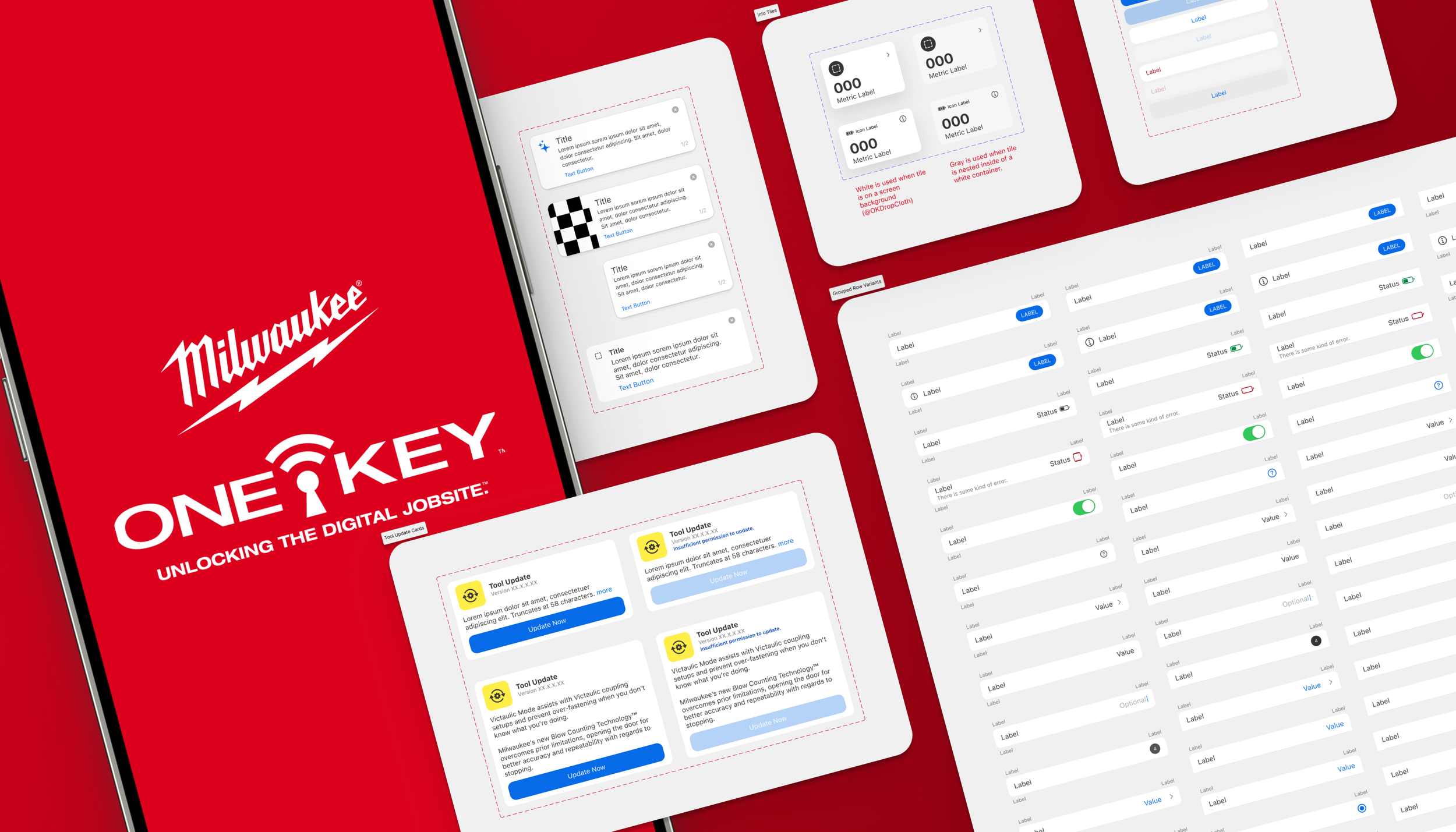
Atomic Principles
The library was first rebuilt atomically, breaking down the key workflows of the app into smaller and smaller integrated pieces of the puzzle.
This process gave particularlly useful insights about how the design team utilizes the system globally and cross-platform.
Responsive Patterns
Initially the library was set up with a fixed standard width that had become outdated. With newer settings to allow the creation of screen-width responsive patterns, the entire library had new parameters applied to the highest trafficked patterns to make them more usable in the testing process on multiple screensizes.
Micro Interactions
To add additional efficiency and usability for experimentation, global interactions within the app like a button animation, were baked into the library itself so it was one less thing for designers to worry aboutin a testing scenario.
SECOND TIMES’ A CHARM
In a single instance of one of the main patterns in just one library, there were more than 90 possible combinations and states it could be in.
That’s a lot of names to come up with.
So how is possible to create a way to make those combinations and states possible, all from one component—and without multiple variant groupings? Master components.
That single component condensed into 4 standard versions based on the placement within an experience, and each with more than 20 variant details that could be adjusted.
Many of the master components built into the library contained similar adjustable attributes:
Icon Options
Categories
Dynamic Text Fields
State Toggles for individual components
Controls for nested components within more complex patterns
Button Options
Image Selection
+ more…
While that might seem like a lot, this meant each designer could accomplish every placement of that pattern within the app, from just one of 4 variants of a pattern group, without skipping a beat. This same method was applied across the library for every variant group that it could be utilized in and making it easier than ever to switch creative around while working.
“Know what would be even better? Master components.”,
said no one, ever.
One-Key™ iOS
42,526
Pattern Placements
In the First 90 Days
One-Key™ Android
24,866
Pattern Placements
In the First 90 Days
One-Key™ Pattern Library
65%
Pattern Library Usage & Adoption
In the First 90 Days
LET’S SEE WHAT HAPPENS
To understand if the new iteration of the design system was successful, a monitoring period of 90 days would show how much the pattern libraries were being utilized.
Over the course of those 90 days, there was a massive spike in pattern usage as designers began to use the new patterns in their work. A lot of the initial numbers were from swapping old with the new, but it was really interesting watching the detachment rates of certain patterns, where designers for some reason broke apart an instance of a pattern for one reason or another. This could reveal there is an issue with that pattern or just the process of ideation and trying something new.
After the 90 day monitoring period, there was an astonishing number of pattern insertions that designers were using in their current and active workflows, with great success in also making designers more efficient in their work.
Designer Feedback
100%
said that the new components made it easier to work and saved them time
WHAT A WILD RIDE
Whew, that was way harder than anticipated.
Solutioning around how the team would maintain and support the design system longer term was first approached with an audit in mind. Identified gaps couldn’t help grow the design system, if no one knew they were there to begin with.
The audit plan consisted of an evaluation of the brand guidelines and global color use, typography, formatting consistent, iconography usage, accessibility principles and more. It documented every gap and void there was left in the system that would need to be strategically closed through ongoing work or larger scale company-wide initiatives.
That’s just the beginning. Now we need a process.
Routine Audit Cycle
An established schedule of routine audits would be completed.
The first batch would occur each quarter, and would surface new additions, UI Bug fixes and revisions more efficiently and keep the system updated more often.
The second batch would be the annual audit, which would audit the app in it’s entirety, and surface areas of focus that should be prioritized.
Documentation
The process of building and publishing components in the pattern library was just the beginning of the puzzle.
Documentation is needing to be the guiding star for anyone who needs help wayfinding the design system. It would have to explore conditional situations a pattern could be used in, how it was formatted, if it had assigned interactions, whether it could exist outside of a certain state and more.
Pattern Process
It became evident that some of the team wasn’t aware of how a pattern would be added into the system, how it was moderated or why the team should utilize it instead of their own creative elements.
In order to alleviate confusion, the design process for patterns was mapped up and compared to existing processes in place to drive context around the lifecycle.
WHERE DO WE GO FROM HERE
Scaling to a multi-product Design System
Due to the structure of the business, One-Key™ experiences are not all treated the same. Most projects operate on a standard sprint schedule. When NPD becomes involved, the process becomes more silo’d to the needs of a single product.
So what happens when you have hyper-specific experiences that exist inside of the One-Key™ ecosystem—or what do you do when experiences use some of One-Key™, but are not a part of the system exactly?
This led to the need to segment some aspect of the design system into their own unique libraries. Not all designers worked in the NPD space, and not all designers worked on other digital experiences, like the Heated Gear mobile app. As such, an approach to both scalability and “living within the family” was the right move to keep each library focused.
Segmented Pattern Libraries
Segmenting the pattern libraries meant going from 3 platform-specific libraries, and growing it through a series of additional libraries that would combine experience-specific patterns into a single library for all platforms—targeted exclusively at NPD and Heated Gear experiences.
This would allow the team to choose which patterns are most relevant to their needs, but remained easy to utilize and followed the same guiding principles.
Keeping them linked to the parent library components enabled an easier way to maintain and keep patterns up to date, and a routine audit cycle would assist in regular review of the files.
Use-Specific Documentation
Due to the complexity of most NPD experiences, pattern-specific documentation on each use case was required.
Documentation had to surface user scenarios for when they’d be delivered which experience, permissions-based scenarios in which they can only do some or all tasks, and interactions that are triggered from which actions a user takes.
If new patterns were being created, it provided developers with exact specifications for building.
This documentation had to be formatted in such a way that it could also be utilized for New Employee Onboarding to the design team and the product family.
Pre-built Screen Templates
To make wayfinding easier for all designers on the team, templates were crafted from the specific collections of pre-styled and defined patterns, and building into fully customizable screens—each with the possibility to be instantly updated to represent a specific user scenario.
These also included some micro interactions already prototyped into the templates to reduce the amount of time it takes designers to create a realistic design-to-app cohesive experience that could be more realistically tested.
MEASURING SUCCESS
How is it known whether the new system was successful?
-
Each library was structured with Atomic Design Principles to set out a strutural standard for building new components and wayfinding in the Design System.
Specialized workflows were moved into targeted libraries to make access to those experiences easier and more valuable to users.
-
By analyzing the old structure of the design system, we had lost sight of the nuance the little pieces have.
By restructuring the design system, the focus on the smallest pieces helped to think of the ecosystem as a nested system of value.
-
By building in responsive features (like making a pattern snap to the right and left edge of the screen by default) became an excellent way to start instrumenting the design system.
Building in base-level interactivity into components enabled designers to reduce cognitive overload with remembering every single interaction, for ever single workflow.
-
The creation of master components for our “Organisms” category of complex patterns allowed us to drive the most amount of usability and value out of every component.
This enabled designers to have full control of every combination there was in a single component variant group. What formerly took hours per screen, could now be completed in 50% less time—meaning they were able to work 50% faster than before on existing experiences.
To push that even further, when premade screen templates were created from the reusable components, it increased their efficiency to 91% compared to no reusable elements.
-
The initial design system audit enabled the identification of the content we formerly didn’t think we needed.
Basics like how to properly utilize font selections, or which type of interaction should be used with a certain component, were things that were often assumed instead of documented.
Building out complete documentation enabled developers to wayfind to the best information when they needed clarity on a new or existing component.
There are limited products on the market at the moment that can successfully track Figma components to coded components—and even fewer that have the potential to work with our existing code repositories. As such, measurement of success in the design system is an ongoing effort to watch how the system changes with time.
There are other subsequent metrics that are able to be utilize on a team-specific basis, like the number of placements of a component increasing as it’s adopted by the team. The simple growth of the pattern library quarter-over-quarter, showcasing the teams’ commitment to remaining an innovation leader in the construction industry. The amount of increased traffic to our design system documentation, highlighting that more people are becoming informed of the value of the design system as a whole, and the key to a consistent and cohesive experience for the digital ecosystem of Milwaukee Tool.
Version 2.0 was an evolving success.
CHECKMATE
The new framework for the design system was deemed a success after meeting 5 out of 6 key metrics being met over the course of one calendar year.
Increased Designer Efficiency
Reduced Usability Frustrations with Patterns
Increased Traffic to Design System Documentation
Complete Documentation of the System
Built-In Microinteraction Prototyping
In the future, the goal is to automate the tracking of individual components in the experience, to measure how we adopt the system in our product. While the system is still growing with each new innovation, a library collection containing the baseline of experiences meant having a more thorough understanding of how the brand is represented across digital experiences.