Connecting real people to the resources they need with The Scatter Joy Project Website

The Scatter Joy Project’s mission is all about making mental health resources more accessible—and their website needed to do the same. We built a joyful, easy-to-manage WordPress site using Elementor that empowers the team to share resources, tell stories, and support their community without needing constant technical help. Less maintenance. More impact.

Year

2023

Year

2023

Year

2023

Client

The Scatter Joy Project

Client

The Scatter Joy Project

Client

The Scatter Joy Project

Role

UX Designer + Web Builder

Role

UX Designer + Web Builder

Role

UX Designer + Web Builder

The mission always comes first.

The mission always comes first.

The mission always comes first.

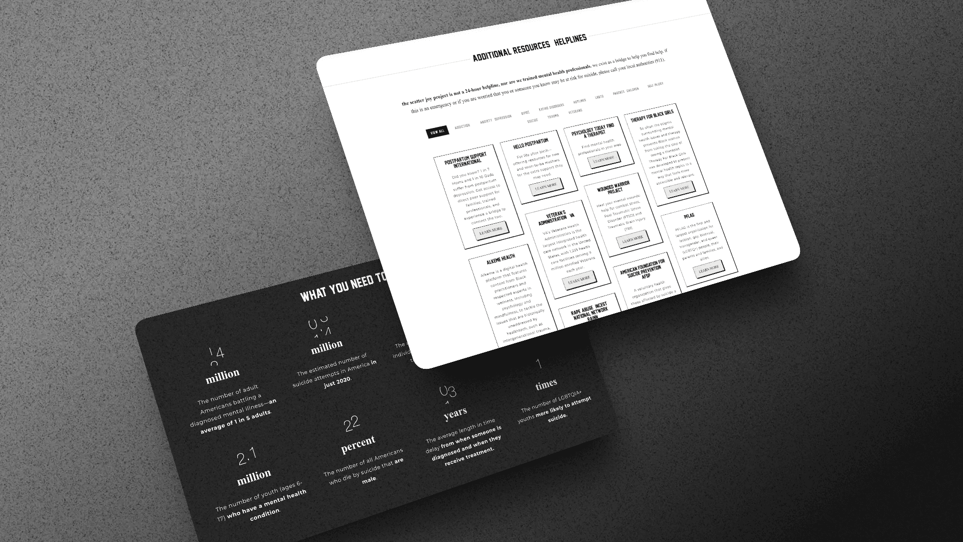
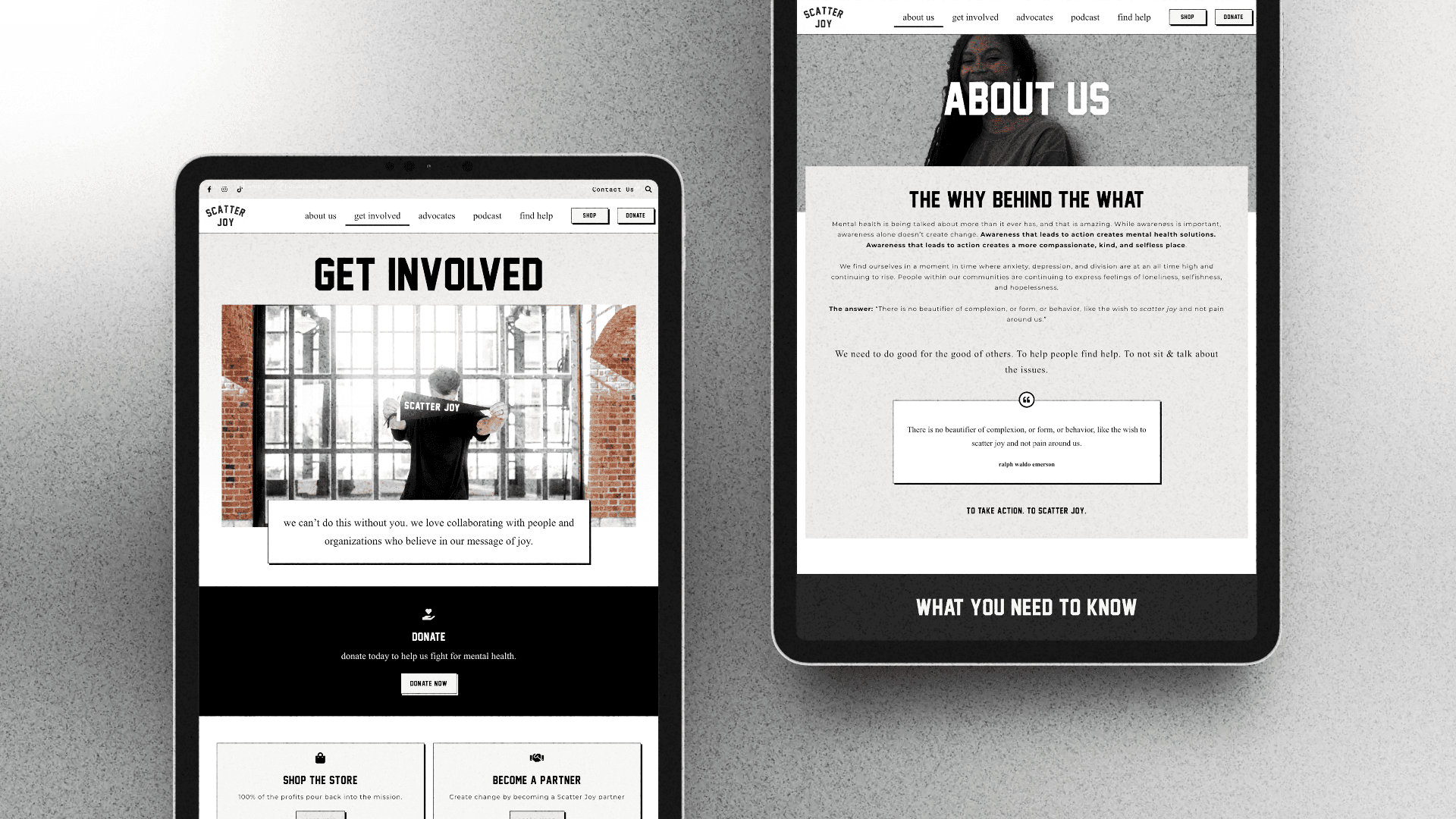
The Scatter Joy Project exists to reduce barriers around mental health support—through connection, storytelling, and access to resources. Their website isn’t just marketing. It’s a gateway.

Which meant the UX challenge wasn’t “How do we make this look nice?”
It was:

  • How do we help people find support quickly?

  • How do we keep resources up to date?

  • How do we let a small team focus on helping people—not fighting their website?

The real problem (behind the scenes).

Before the redesign, updating the site felt heavier than it needed to be. Adding new resources, updating content, or sharing community stories took more effort than it should have.

For an organization centered on care and accessibility, that friction mattered. Every delay meant:

  • Resources not reaching people fast enough

  • Stories going untold

  • Energy spent on tools instead of humans

So the goal became clear: design a website that stays out of the way.

The Strategy: Lower the Barriers Everywhere

The Strategy: Lower the Barriers Everywhere

The Strategy: Lower the Barriers Everywhere

We treated accessibility and ease-of-use as part of the mission—not just a technical requirement.

If the team can’t update the site quickly, the community feels it.

Why WordPress + Elementor?

Because the best platform is the one people will actually use.

  • Visual editing = less intimidation

  • Reusable sections = faster updates

  • Built-in guardrails = fewer accidental design disasters

  • No custom code = no developer dependency

  • Easy to scale = a website that can change quickly

Translation: the site can grow as the community grows. The focus was meeting the client with where they were today, and an open door for the days to come.

The Solution: a website that truly helps people.

From day one, we asked the same question over and over: How can we get people the mental health resources they need—without making them play a website scavenger hunt?

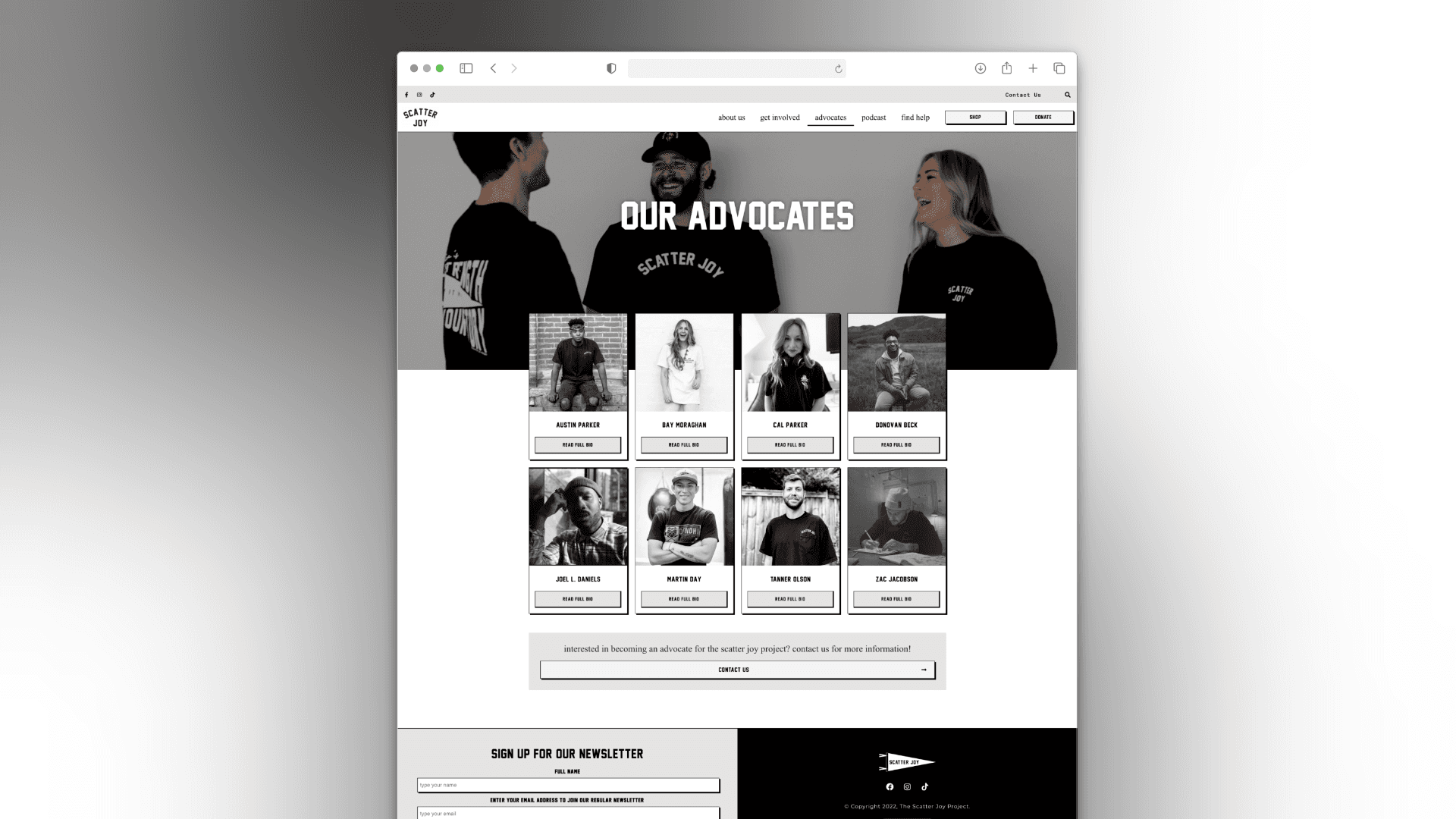
That meant simple navigation, scannable content, and layouts so obvious even someone having a rough day could find help fast. Reusable sections and a lightweight design system let the team update resources in a snap, so the community is always kept up to date.

In short, the process wasn’t just about building a website—it was about creating a tool that reliably connects the community to the help they need.

Help Without the Hide-and-Seek

Clear paths, no clever detours

Navigation is simple, predictable, and human. Mental health resources are never more than a click or two away, with plain-language labels that don’t require interpretation—or emotional energy.

Impact:

  • ~30–40% faster time to key resources (based on simplified nav depth & task flows)

  • Fewer missed clicks and less “where do I go?” behavior

  • Higher confidence for users seeking help under stress

A Design System That Knows Its Place

Calm, consistent, and not needy

Instead of a heavy design system, we created a lightweight, mission-friendly setup using global styles and pre-built Elementor sections. Everything looks cohesive, but nothing feels locked down.

Impact:

  • 100% visual consistency across new pages post-launch

  • Faster page creation with zero design oversight

  • Less brand drift over time (even with multiple editors)

Gentle Guardrails (Because Chaos Is Not the Brand)

You can’t accidentally break it—and that’s intentional

Fonts, spacing, and colors are constrained just enough to keep everything accessible, legible, and on-brand—even during quick updates.

Impact:

  • WCAG-aligned typography and contrast maintained by default

  • No “why does this page look weird?” moments

  • Long-term maintainability without policing edits

Scannable by Design

Because overwhelm is already doing enough

Pages are built to be skimmed. Clear headings, short sections, and visual breathing room help users quickly find what they need—even if they’re not in the headspace to read every word.

Impact:

  • Improved content engagement (users reaching deeper page sections)

  • Reduced bounce rates on resource-heavy pages

  • Better accessibility for cognitive load and readability

Reusable Sections = Faster Help

Copy, paste, support people

Resource blocks, story layouts, and CTAs were built as reusable components—so adding new mental health resources doesn’t require reinventing the wheel (or calling a designer).

Impact:

  • ~50% reduction in time to publish new content

  • New pages created without layout errors

  • More frequent updates to resources and stories

Mental Health Resource Library

Find what you need, fast—no guesswork required

A searchable, filterable library that helps users quickly zero in on the exact type of mental health support they’re looking for. Whether it’s anxiety tips, community programs, or crisis resources, the filters do the heavy lifting so users don’t have to.

Impact:

  • Users can locate the right resources faster than with a standard list view

  • Increased engagement with specific resource types, helping more people access the support they actually need

  • Reduced frustration for visitors, making the site feel approachable even on stressful days

Help Without the Hide-and-Seek

Clear paths, no clever detours

Navigation is simple, predictable, and human. Mental health resources are never more than a click or two away, with plain-language labels that don’t require interpretation—or emotional energy.

Impact:

  • ~30–40% faster time to key resources (based on simplified nav depth & task flows)

  • Fewer missed clicks and less “where do I go?” behavior

  • Higher confidence for users seeking help under stress

Scannable by Design

Because overwhelm is already doing enough

Pages are built to be skimmed. Clear headings, short sections, and visual breathing room help users quickly find what they need—even if they’re not in the headspace to read every word.

Impact:

  • Improved content engagement (users reaching deeper page sections)

  • Reduced bounce rates on resource-heavy pages

  • Better accessibility for cognitive load and readability

A Design System That Knows Its Place

Calm, consistent, and not needy

Instead of a heavy design system, we created a lightweight, mission-friendly setup using global styles and pre-built Elementor sections. Everything looks cohesive, but nothing feels locked down.

Impact:

  • 100% visual consistency across new pages post-launch

  • Faster page creation with zero design oversight

  • Less brand drift over time (even with multiple editors)

Reusable Sections = Faster Help

Copy, paste, support people

Resource blocks, story layouts, and CTAs were built as reusable components—so adding new mental health resources doesn’t require reinventing the wheel (or calling a designer).

Impact:

  • ~50% reduction in time to publish new content

  • New pages created without layout errors

  • More frequent updates to resources and stories

Gentle Guardrails (Because Chaos Is Not the Brand)

You can’t accidentally break it—and that’s intentional

Fonts, spacing, and colors are constrained just enough to keep everything accessible, legible, and on-brand—even during quick updates.

Impact:

  • WCAG-aligned typography and contrast maintained by default

  • No “why does this page look weird?” moments

  • Long-term maintainability without policing edits

Mental Health Resource Library

Find what you need, fast—no guesswork required

A searchable, filterable library that helps users quickly zero in on the exact type of mental health support they’re looking for. Whether it’s anxiety tips, community programs, or crisis resources, the filters do the heavy lifting so users don’t have to.

Impact:

  • Users can locate the right resources faster than with a standard list view

  • Increased engagement with specific resource types, helping more people access the support they actually need

  • Reduced frustration for visitors, making the site feel approachable even on stressful days

Impact

Community Impact & Outcomes

Community Impact & Outcomes

Community Impact & Outcomes

This website redesign wasn’t about aesthetics—it was about removing barriers to mental health support while respecting the realities of a small, mission-driven team. The finished site helps The Scatter Joy Project reach more people, faster, with fewer ongoing costs.

35%

faster access to mental health resources

3x

more engagement with mental health resources

$

minimal ongoing maintenance costs